A New Portfolio

By Johannes Wienke
I took the opportunity to use the last few weeks for a complete overhaul of my aging portfolio website. The result is the new site you are currently seeing. It uses modern technology, is mobile-first, and provides even more space to showcase the main content: the photos.
Technology
Hugo static site generator
As already for the previous incarnation of my portfolio, my decision was to use a static site generator such that I can avoid any dynamic parts on the server side. This prevents many security issues and also results in fast loading times. So far, I had used Jekyll for this site and Middleman for my tech blog. From a technological point of view I am more in favor of Middleman because of its greater flexibility. However, what both frameworks lack is good support for managing photos, which is one of the main aspects of a photography portfolio. Therefore, I searched for alternatives and finally selected Hugo as the basis for the new portfolio. With page resources photos and other assets can nicely be bundled with the page they belong to and Hugo’s image processing features make it really easy to crop or resize images automatically.
Theme
When starting this project I had the hope that I could speed up the process by building onto an existing theme. Therefore, I took some (longer) time to browse through the available Hugo themes. However, not many of them were suitable for the kind of site I was envisioning with a portfolio, photo stories, and a blog section. Many visually appealing themes are limited to single page designs, which doesn’t work for this structure. One of the closest candidates was Massively, which is also used by Urs Zihlmann for his portfolio. However, I didn’t like all aspects and also I didn’t want to end up with a completely similar page. Therefore, I finally decided to build something on my own, however, based on the CSS framework Bulma as the means to speed up the process.
Responsiveness and lazy-loading
Bulma is already mobile-first and all Bulma elements easily work on mobile platforms.
However, photos are the main content on this site and I also wanted them to be responsive such that for each device the photos are downloaded in a suitable resolution.
This especially avoids excessive downloads on mobile devices.
Fortunately, the web has matured enough to finally provide native HTML solutions for this problem and hence every large image on this site (apart from the gallery overview) now uses either img tags with the srcset attribute or - depending on the situation and the surrounding containers - picture elements with multiple sources.
In addition, most images are tagged with loading="lazy".
Modern browsers only download these images when they become visible through scrolling (or shortly before).
This again saves bandwidth.
Structure
So, what does the new site look like and what were my decisions regarding the layout?
Home page
My main idea with the home page (as already with the previous site) was to make my best images the most prominent feature. Therefore, they are presented using a fullscreen carousel.
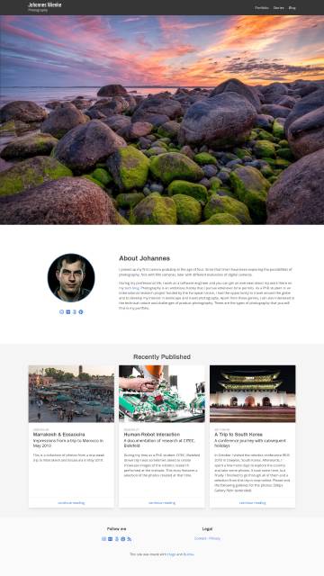
New on this page is the brief “about me” section and a “recently published” section to put some emphasis on new posts and especially photo stories.
For the carousel, I am using Flickity, which has support for responsive images and a fullscreen plugin. These were the reasons for selecting Flickity instead of the Bulma Carousel extension.
Galleries
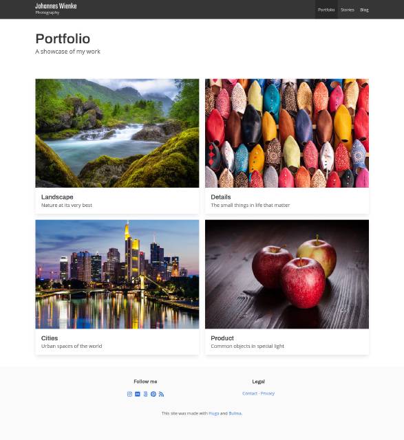
Instead of relying on a carousel/slider as on my previous site, I have this time decided to use a Justified Gallery with a fullscreen lightbox (lightGallery) for showcasing my work. This gives a better initial overview of each collection of photos while still providing the elegant fullscreen display if desired. Both selected tools support responsive images, although Justified Gallery only with JavaScript support. lightGallery is also used for a fullscreen display of images inside blog posts and photo stories, such as the one below.
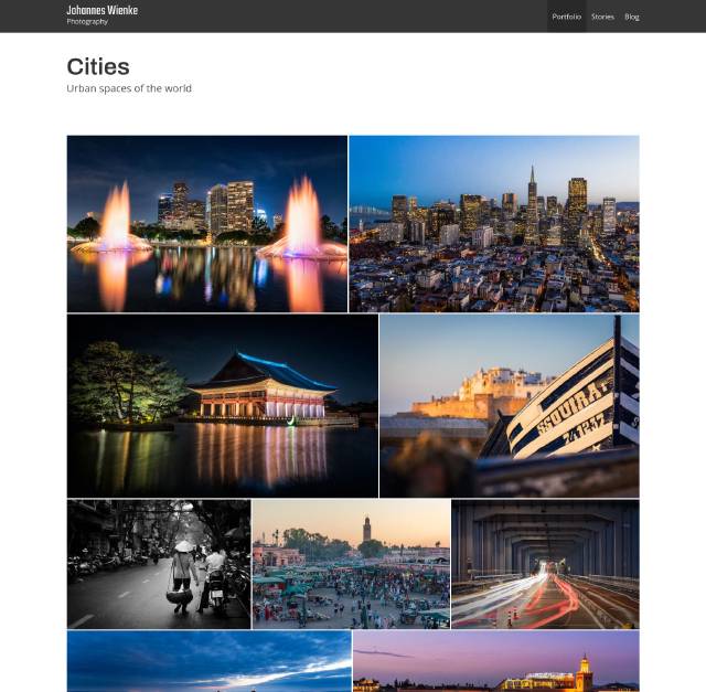
Photo stories
A new element of my site is the photo story section where I display series of related images. I have been using Exposure and Behance for such content. Exposure creates wonderfully styled stories and resonance is quite nice, however, pricing soon gets heavy. Behance, on the other hand, is free but resonance and layout possibilities are quite limited. Also, the situation with other social sharing sites is currently relatively unclear and big players are losing popularity. Therefore, I decided to create my own space for such photo stories and series with a style comparable to Exposure. This is the result:
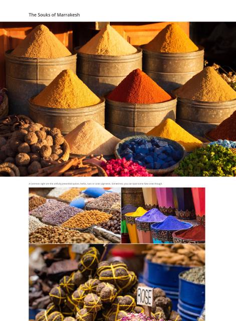
Stories use text blocks, hero images in full width and justified galleries as the main presentation formats. All images can also be viewed in fullscreen using a lightbox. The same elements are also available to normal blog posts.
I hope that this gives a good platform for my images and serves as reasonable basis for the next few years.